

The Comparative Impacts Project
The Comparative Impacts Project is an interactive educational tool focusing on electrical energy sources and their related emissions.

The major goals of this project are:
educate individuals on the complexities of energy sources
compare environmental, health and social costs of energy sources
explore pros and cons of different electrical energy portfolios for a city
empower individuals to make informed decisions around energy
The methods used to accomplish these goals are:
making the information more relatable through user input
making the results simple to understand through data visualization
promoting critical comparison of energy sources through interaction and manipulation
The project is intended to be used in the educational/classroom domain, with a specific age group of high school to university.
This project is being developed with Bhawani Venkataraman, Associate Professor of Chemistry at the New School, and was presented at the 3rd National Energy Education Summit in Washington D.C. (2018)
Technologies Used:
D3.js
Iterations:
The Comparative Impacts Project was born out of conversations with Bhawani Venkataraman, Associate Professor of Chemistry at The New School, about the many complexities surrounding electrical energy generation technologies. We sought to bring these complexities to light for a broader audience without oversimplification but with interaction, data visualization, and transparency of information.
The beginning of this body of work consisted of:
researching scientific literature
gathering data
reviewing other information based interactive projects
constructing and disseminating questionnaires to our target audience
brainstorming the most effective ways we could accomplish our goals
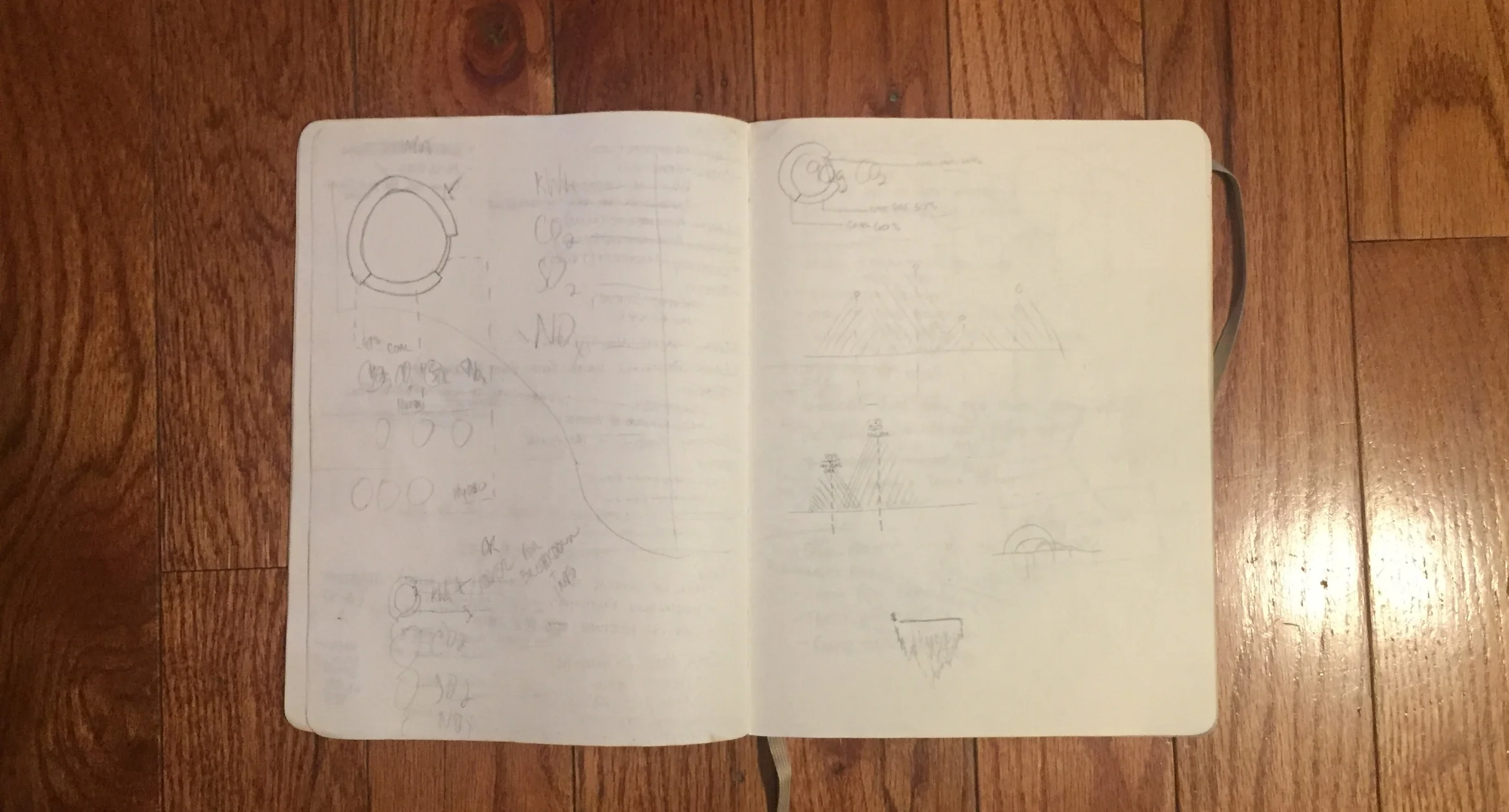
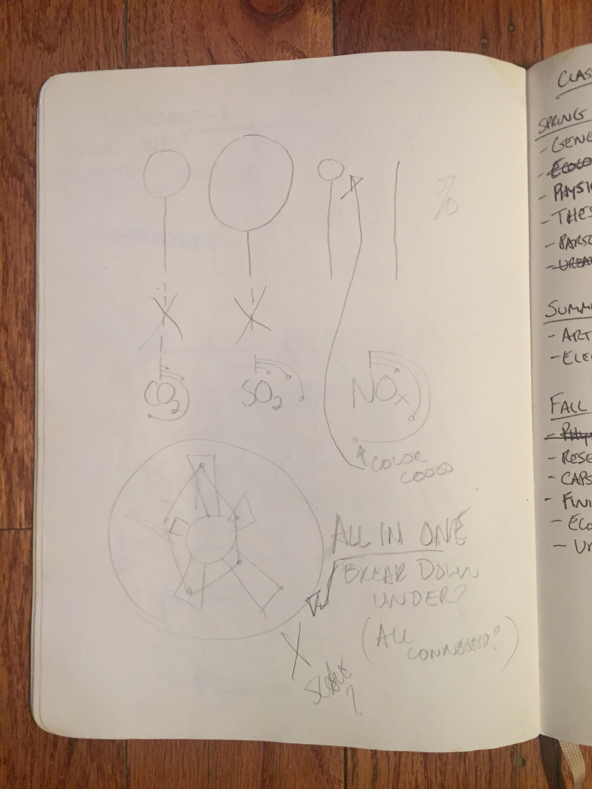
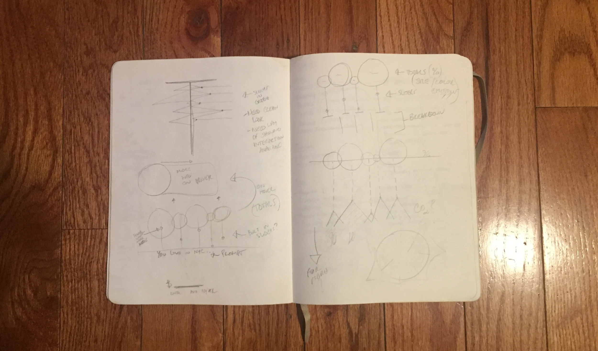
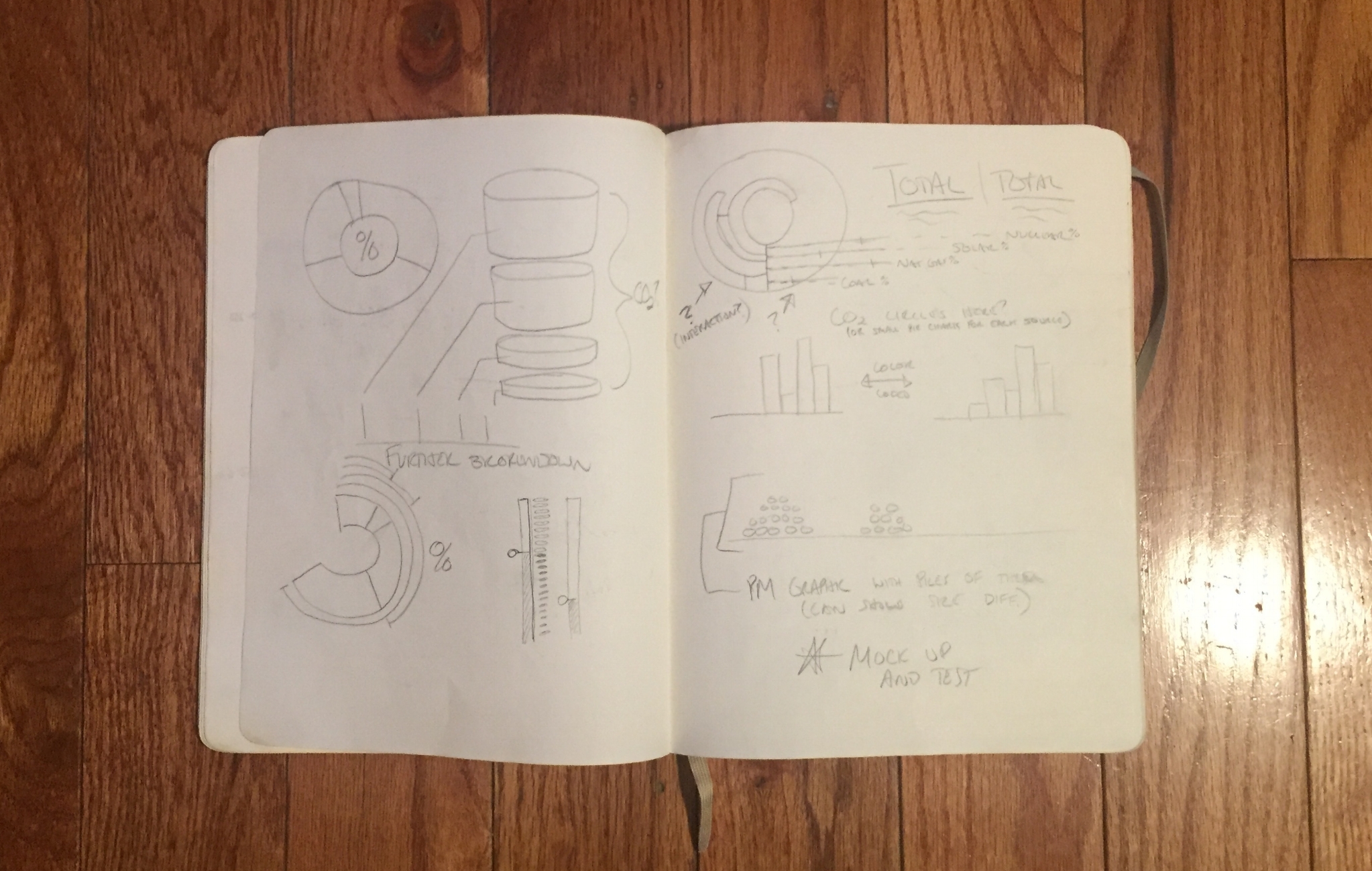
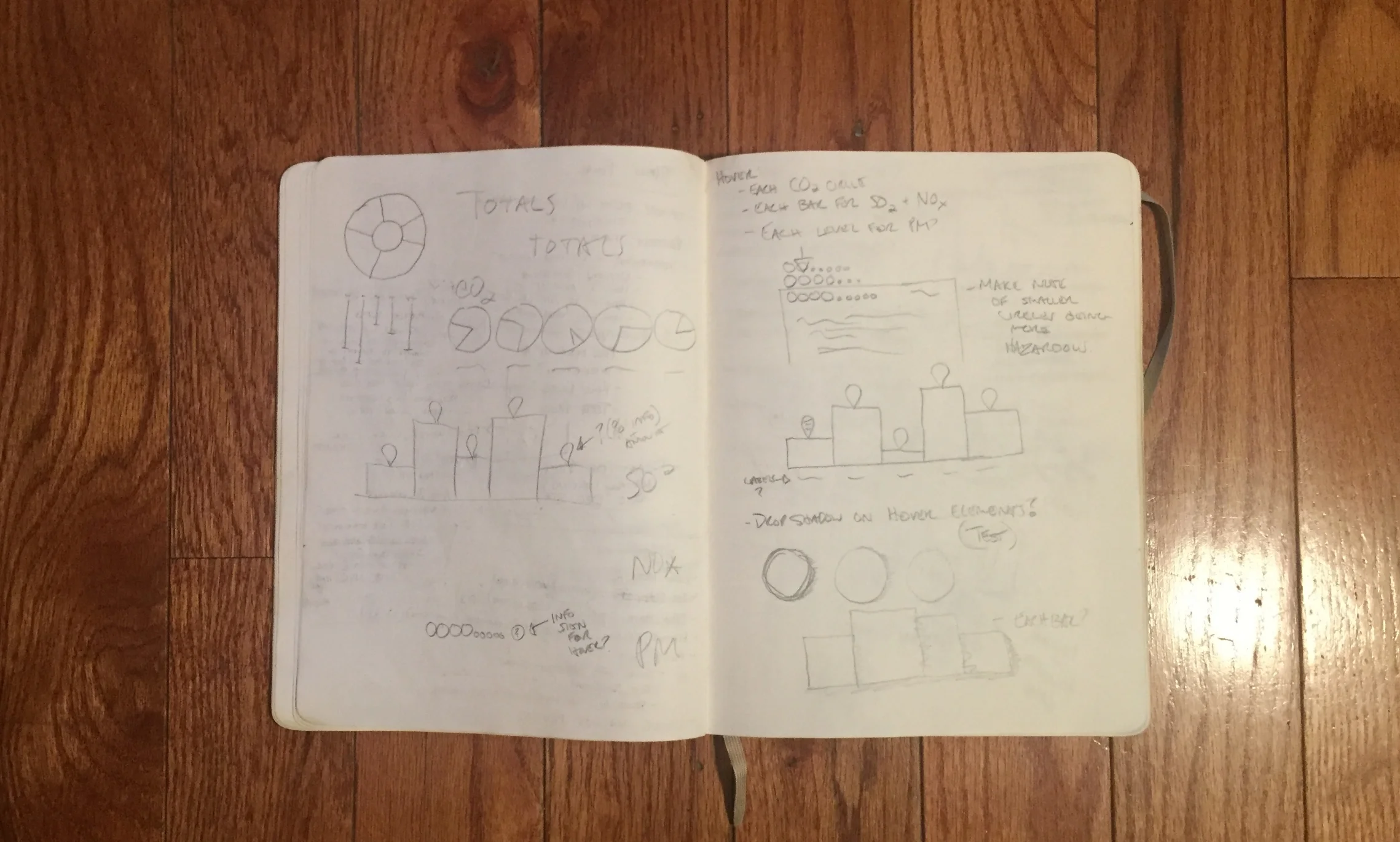
Once we had set out more detailed goals and means by which to accomplish these goals, I began mocking up interfaces for synthesizing multiple layers of data.


Lo-fi digital mockups: used for user testing and interaction mockups


At this point in the process, I had written some of the basic building blocks of the code and we had received a lot of feedback about what people responded to when viewing data in different forms. There was a tendency to prefer visuals that were recognizable such as histographs and line charts which lead to some of the mock ups above. But, I felt that these were not visually interesting enough to further engage a user, so I went back to sketching interfaces with the intention of creating something new that had recognizable elements.
At the same time, I began to storyboard a narrative, into which this main visualization could find context for the user.


